Labels
It’s shopping season, and you’re buying the same thing over and over again.

A weird thing happened to me recently. I was at my neighbourhood organic shop to pick up a jar of overpriced, hand-pounded mustard to which I am stupidly addicted. When I got home, I discovered that I hadn’t grabbed the usual white-labelled glass jar. Instead, a jar of artisanal mayonnaise from a completely different brand had made its way into my bag.
I’ve been thinking for a while now that new Indian food brand labels have started looking terribly alike. But there’s a structural problem underlying my mustard-mayo mix-up, which is masked by the tyranny of algorithms and the global embrace of aesthetic sameness. [1] Earlier today, I visually ingested a tub of Greek yoghurt; organic cinnamon; farm-fresh subscriber-only fruit; parmesan wheels, handmade ice-cream, and sriracha that yells “artisanal and small batch,” all within five seconds of logging in to social media. [2] On any given day, there is no chance that I will have more than a vague recollection of any of these products, seamlessly blurred as they are with a gallery of selfies that precede and follow them.
This is what I know: on all counts, some of us have reached fully automated, gastronomic simulacrum. [3] Like many of Instagram’s 120 million Indian users, I willingly drown myself in a panorama of indistinguishable sponsored food ads daily. Their labels follow an aesthetic formula that makes them appealing and claustrophobically similar: lots of white space, static close-ups of a special ingredient, limited copy in a serif typeface.
It is not just that the bland brand [4] ––an identikit best described as millennial, minimal, safe––has finally come to India, or trickled down without abstraction. As scholars of Indian branding tell us, [5] if there is one post-liberalisation rule that applies to everything from McDonald’s to Sanjeev Kapoor’s packaged sauces, it is that things have to be simultaneously global and Indian. That was what marked our shift from the Licence Raj era.
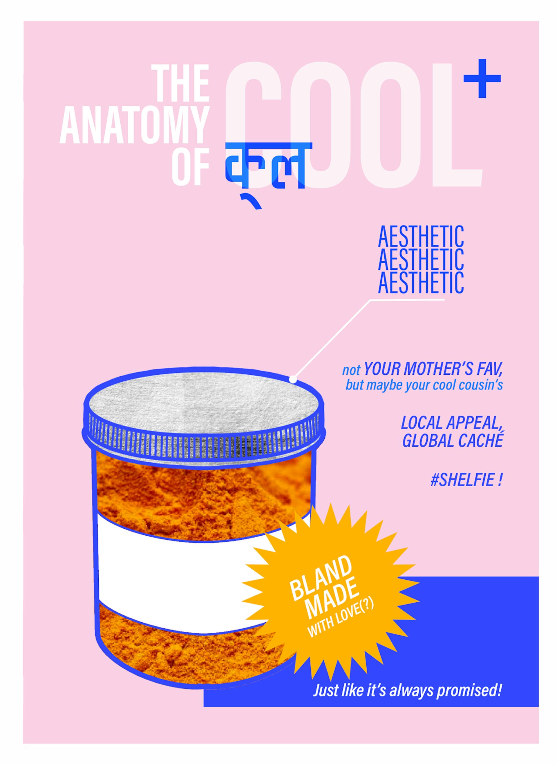
Illustration by Pia Alize Hazarika
In the early 1980s, for example, consumers’ inner lives were privileged over their Indianness. Phrases like “your favourite taste” and “made with ingredients you know” (both seen on Maggi’s 2-Minute noodles) did the trick. From the 1990s on, selling Indianness became important as local markets opened up to foreign products and influences. Marketeers tackled this by capitalising on local ideas of fun: in advertisements, an iced Coke provided a frazzled bride some relief; a small group of friends happily shared a single pack of snacks. Packs of chips and candy dialled up the fantasy: Piknik, Fusen Gum and Fatafat were mini circuses on a label, exploding with colour and comedy. Biscuits such as Good Day and Nice assured us of a safe but fun time in the time-honoured middle class Indian way: nothing too edgy.
By the mid-aughts, designers had begun to simplify things. They often retained bright colours but slashed the amount of copy, and made a big deal about symmetrical design. The minimal aesthetic now popular in developed markets began to creep in. But marketing MBAs and product executives stuck to the indigenous brand rule: Lay’s Chips was still calling itself “India’s Best.” Bilingual ad copy was now ubiquitous: Balaji Wafers wanted you to eat “Aloo Tikki Flavour,” a phrase that would make no sense to anyone outside the subcontinent.
In the last decade—which belonged to Instagram—the cultural negotiation has graduated to a level so slick that cultural negotiation itself is fetishised. Contemporary food brands that speak the language of digital gastronomy now make India appear exotic to Indians. Several strategies create the cultural distance necessary for this to succeed. There is, for example, the stripping down of information (take Raw Pressery’s “....and nothing else”), which takes buyers out of their own context by playing up simplicity in a culture of excess.
Copywriters now conflate “simple” with “better,” because the global privileged customer demands this form of brand nudity. This has also means that sociality has been sidelined in favour of individual consumption. Chips brands like Peppy and Piknik now relegate the “share” message to the corner of the pack, while prioritising nutritional facts and concerns (“less oil”).
Raw Pressery may earn kudos for being a clean label, but it isn’t really blazing a new path in design. Great labels, from the point of view of talented graphic designers in urban India, do something more. In my own view, they keep the traditional cultural negotiation alive while finding new ways to self-exoticise.
As an example, my friends in branding often bring up @bhawandelhi, a new snack delivery service run by the popular restaurateurs Kainaz Contractor and Rahul Dua. Bhawan advertises itself as a destination for “street food superfans” who are drawn to “timeless flavours made contemporary.” They sell bacon-and-cheddar loaded kachoris. This is a language and menu that privileged Indians intuitively understand. In brand language that imagines the world as an oyster, collapsing extremes—like bacon and kachoris—is one way to ensure that something is new and exciting.
The work of branding agency Animal, the Bhawan aesthetic feels at once familiar and new, worldly and hyperlocal. Minimal renditions of messy-eat-with-your-hands snacks and meticulously drawn, detail-free electric green mirchis appear against solid-coloured backgrounds, shades you’d associate with Premier Padmini cars. The product name is cleanly listed in both English and Hindi. The saturated gulab jamuns and abstract border motifs recall Indian calendar art.
All this is largely for totemic value. The design isn’t allowed to veer off into the hectic messaging and “more is more” flourishes of local business. The entire aesthetic is controlled with hyper-clean lines, bold fonts and symmetrical layouts. [6]
What I find remarkable about Bhawan is this: It demonstrates how brands can be fun, conform to the Indian brand bible, and fall into the new trap of global design. The cultural negotiation is there, but now, sophisticated design subsumes it within the empire of bland branding. This gives chaat not only local appeal but global cachet. Elsewhereness is built into the language: there is a feeling that the designers behind this brand are globally savvy, if not additionally Western-educated, while being Indian. And this elsewhereness is what makes the brand Instagram-worthy, and therefore, worth more of your money.
Bhawan’s work got me thinking: What choice do the makers of a hip new Indian food brand have if they must continue to subscribe to the bible of Indian branding, but now sell products to an increasingly sophisticated audience who may eat chaat one day and sashimi the next? I can see that creative talent is alive in our country; but I also see the limits of cultural expression for the makers of new-age brands who work within the new set of rules.
Blands (And Nothing Else)
ou could argue that the bland brand making its home in India is the way of globalisation. But the spread of ‘global’ is never equal. [7] Whether Delhi or Kozhikode, between or beyond, we inherit unevenness, even in modern corporate aphorisms that tell us things like “design is the only brand differentiator we have today.” [8]
Global, bland design comes to us as pre-determined “good design,” the work of high-thinking mavens in progressive California. Thanks to First World liberals who are inextricably linked to this aesthetic (Whole Foods and Trader Joe’s shoppers), we imagine them to be eco-aware, just, and transparent.
When we replicate the markers of aesthetic blandness, we replicate an idea of the foreign elite with whom we have an ambivalent relationship. To over-identify with them threatens our idea of “roots.” But the ability to share many of their references—turmeric lattes, favourite restaurants in Covent Garden or on the Upper East Side—remains important.
This comes at a cost. Aesthetics have always signalled quality, class and ethics, but to accommodate how this works in 2020, we have altered an existing native language. What’s funny is that we may have been achieving much more in the first place. For example, hyperlocal production has long been a fact of Indian life. Yet, new-age organic brands position geo-locality as both exotic and the main node of the brand story. On the jam labels of a brand called Kumaoni, for instance, the distant hills appear foreign, thanks to their nondescript, digitised neutrality.
To achieve this “new” feel, Indians must clean up and quiet down. In-the-know designers work within a small family of typefaces and won’t cross a certain type size. Labels now speak in the way a spa therapist might. I’m thinking of Atmosphere Kombucha, which deploys most of its copy allowance to tell us that its “gentle and floral” notes will “calm” and “relax.” (I have lost count of the number of tea brands on Instagram that use identical copy.) And it is, of course, “made with love in Delhi.”
This label assumes that we’ve been drinking kombucha for so long that it comes to us as succour rather than something quite thrilling. The language is completely divergent from the brand stories that have shaped us. Even a cursory browse through food labels from the 1980s and 1990s indicates that Indian consumers were once assumed to have a great capacity for information, both in quantity and diversity. We would digest product name, description, use, multiple visuals, sentimental message, some company history, benefits, and licence information in a single take.
The shift in assumptions, to my mind, is another display of Western power. Unsurprisingly for a nation-state that has been officially or unofficially been at war overseas since 2001, American design is militarised. And because the power is achieved via a designed-to-be-simple aesthetic that makes it easy to “swipe, like and share,” it ostensibly softens its cruelty. This is what we, in India, miss when we reproduce minimal chic with minimal resistance.
Top Shelf
ndia’s metropolitan organic and speciality stores are full of brands that are clinically clean and indi-cool. [9] The latter has fun built into it, but not your same old desi fun. What we are paying for in the fancy shop is the cleaning up of Indian-ness. Indian elites love to make fun of Western reinventions like the golden latte. But our own shelves now stock turmeric that’s no longer just haldi, for example; we get products that describe themselves as artful blends of turmeric, cinnamon and ginger, while leaving minimal traces of the maker. Far distant is the face of the founder, or exciting words like “chunky” to describe spices, both of which may be found on the labels of MDH masalas. In fancy shops, the absence of information, origin, and sentiment often makes the label exploitative of its own context.
Then we have indi-cool, which appears like a piece of cultural exotica on the store shelf. Paradox is built in. Think of it as ‘kitsch minimal’ or ‘truck art clean.’ Here, the trick is to not only make India look exotic to Indians, but allow the cultural subordination to appear hip. Motherland (with its gourmet banana and tapioca chips) is a good example. Its metallic packages pop on the organic shop shelf—they reference the indigenous and bow to the symmetrical sanctity of the bland brand. This is achieved by making the Malayalam text neon and angular. The brand name is a clever way to pre-empt the critique of colonised branding.
It is cool—as a form of miscegenation. [10] Indigeneity is incorporated and then tamed. The limited text, anaemic descriptions, colour palette and typeface are a tap away on Instagram Stories’ “create” function. Listed Indian ingredients are reduced to one word, and appear with a ‘+’ between them. The wild country is cool and quantifiable, and yet, we know nothing of who in the “aromatic south” makes these foods. It may not matter much to the consumer who is ready to pay ₹360 for a pack of three, sold on this moment that allows them to experience a powerful union of their visual and gastronomic universes.
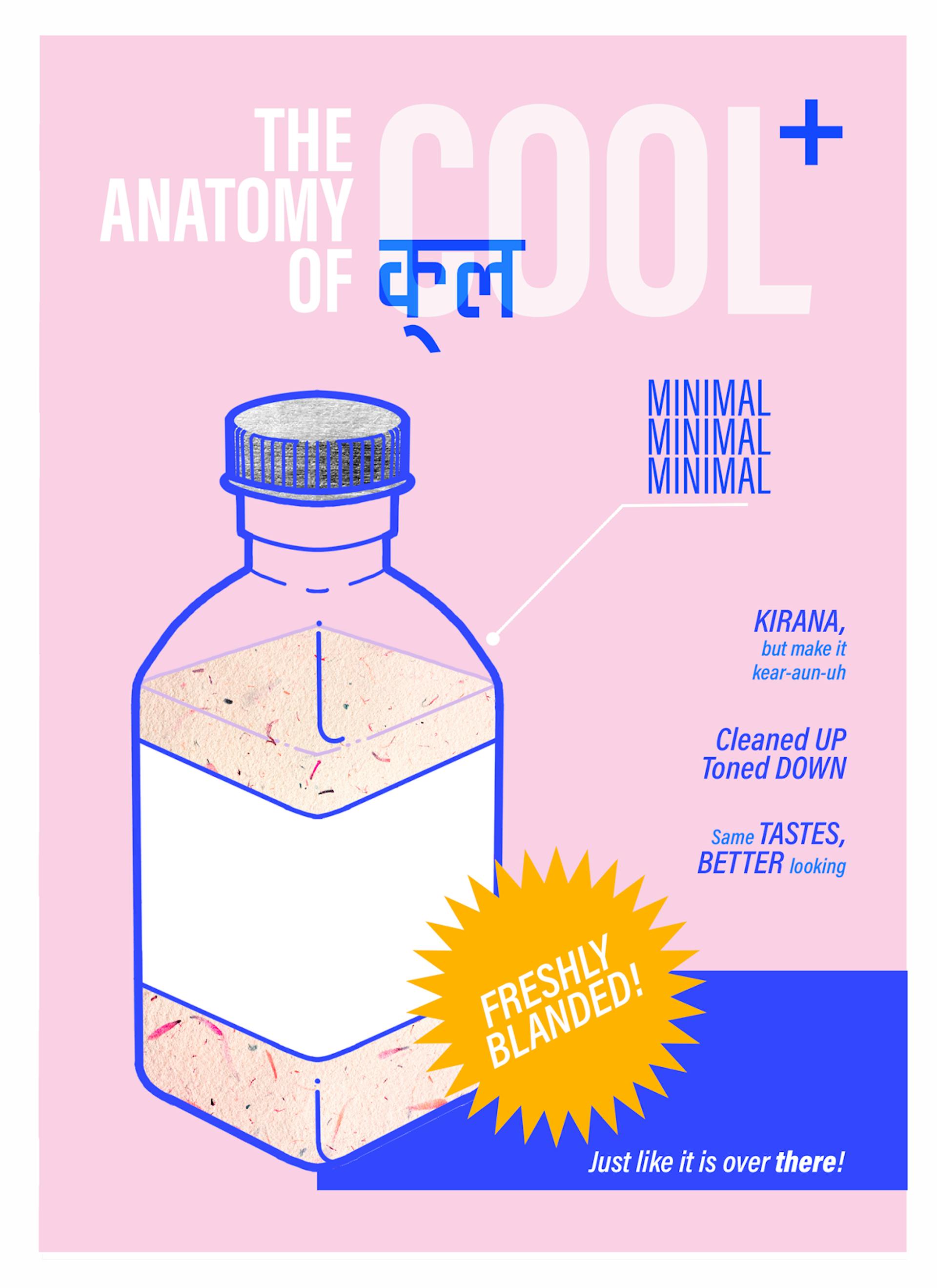
Illustration by Pia Alize Hazarika
To be valid in the fancy shop, it’s not enough to simply and boldly announce you have been in business for 150 years. You have to do it in a way that is friendly, knowledgeable and succinct. The soft-medicinal, quasi-spa route, as with Atmosphere’s Kombucha label, is one choice. But chattiness gives you more of a pop. Take a slogan like “THE BEST HING EVER,” which mimics your buddy talking to you. She’s a buddy who can affirm the quality of this asafoetida and go drinking with you after. Sometimes, these “buddies” are the names of the founders, but they must be names that work: Gouri and Mo (both cookie brands) roll off the tongue, all nice and familiar. (Needless to say, I mention these brands and creators to illustrate my point. Their competitors and imitators are no more or less worthy of scrutiny.)
Label images of the product have also undergone notable transformations. Sometimes the date on which a formula was made or pickled appears in squiggly handwriting, evocative of a Caucasian mother’s love note (unless you are the rare Indian whose mum left you letters in your tiffin box).
Not so long ago, flash photography was the rule, and packages showed what and how much of it went into your product. The omission of this communication assumes that you, the consumer, have achieved such a degree of bourgeois stability that you don’t even have to ask how many portions of x are inside the bag. Further, the material used to package these products—I often see recyclable glass and mason jars, finished with copper lids and twine—allow enough negative space for the real food to do the talking. The material works to echo the transparency the elite consumer desires, and I guess, embodies.
Around The Corner
his is all quite different from the ‘regular’ supermarket, until it isn’t. In urban India, the kirana shop or the get-all-packaged-goods store still outnumbers organic shops many times over. These cater to the middle class, which actively shops for Maggi noodles, Marie biscuits, Priya pickles and Haldiram’s namkeens. The label aesthetic in these places exists on a spectrum. One established designer tells me that they look like they are “stuck in the early 1990s.” They are mass-produced, use unfashionable preservatives and additives, and don’t seem to care about the environment. But I noticed that these labels don’t equate morality with price. I agree that they may be “uncool,” but they also offer some important, even if largely accidental, resistance to the tyranny of globally hip design.
The labels in the local kirana are still alive in a way that middle class aesthetics are: chaotic, emotionally rich, getting on with it. This is often achieved by ascribing the quality of buoyancy to the main ingredient on the label. Mother Dairy Lassi, for example, is half-covered by the splash of the yogurt liquid. Bagrry’s zooms into the muesli grains to make them larger than life. Crax corn rings (“baked, not fried”) tantalise the customer with “Free Gifts Inside.”
Many of these labels have a tone of voice that is warm or excited. They still express an interest in the consumer as a biological entity who looks at food as nourishment rather than an aesthetic or moral choice. Tata Salt matter-of-factly tells you that its product will “help mental development.”
Of course, the Indian supermarket sells emotion too: but what a difference in its expression from what you get at the fancy shop. The affordable Bismi’s Rusk is upfront about the fact that “love is like bread, it needs to be made fresh everyday.” At the organic shop, you’re more likely to get the calculated breeziness of the “whole lotta love” with which the nut butter brand HappyHealthyMe claims to make its products.
The food of the middle class is not put together or “curated” by artisans and craftsmen. When information about an owner is on the packaging, it is without fetish and finesse. The Bengali chanachur [11] brand Mukharochak uses most of the real estate on its packaging to display an unremarkable black-and-white photograph of the founding gentleman.
But the gap is closing, and there are quite a few labels in the supermarket which are in transition. Take Urban Platter, and their Calcutta Paan label. A pair of Indian elephants and the bright pista green background suggest that it is not interested in the clinical. But before you mistake the package for something non-bland, you notice the anomalous white fleur-de-lis motifs and the word “Calcutta” in italicised font—as if it were as foreign as Stockholm. The product is described as a “refreshing ethnic mouth cleanser.”
The single word—“ethnic”—allows the consumer to imagine himself or herself as looking in from the outside. This pulling away from context is to stress the point that this is not the paan of your childhood. It is sophisticated, a world away from the dusty, unhygienic places in which the betel leaf is consumed in a different India. Label design makes this paan about taste. Needless to say, it’s also Instagrammable: a great fit for life in a grid.
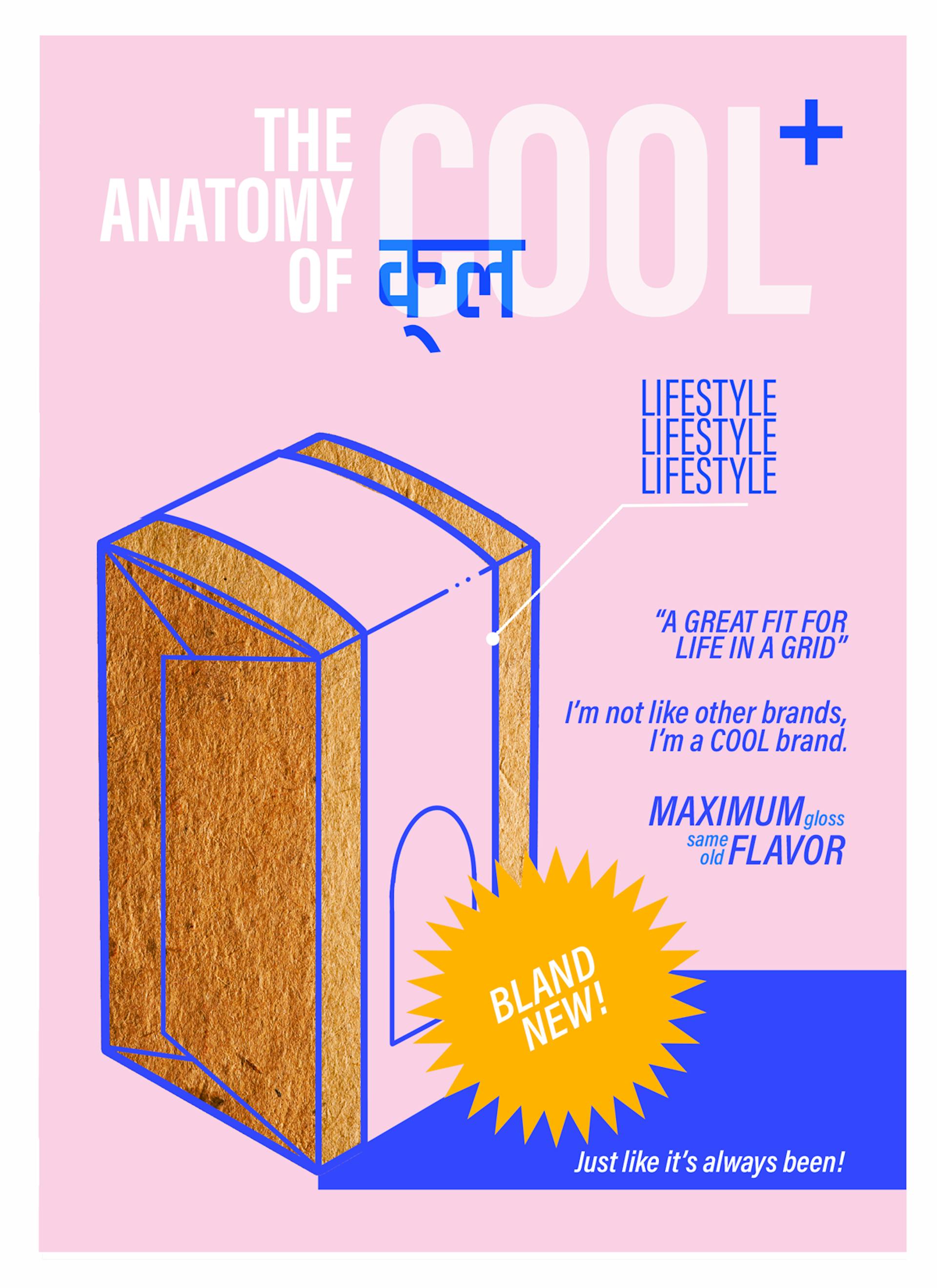
Illustration by Pia Alize Hazarika
Meher Varma is a cultural anthropologist, brand storyteller, and writer. You can find more of her work on mehervarma.com and at @agramofmeher.
Pia Alize Hazarika is an illustrator primarily interested in comics and visual narrative. Her independent/collaborative work has been published by Penguin India (The PAO Anthology), COMIX.INDIA, Manta Ray Comics, The Pulpocracy, Captain Bijli Comics, Yoda Press, Zubaan Books and the Khoj Artists Collective. She runs PIG Studio and bounces between New Delhi and Mumbai.